We love the London Underground map. To many, visually, it is London and from a designer’s point of view it is the transit map that set a standard in legibility and clarity for so many others around the world. It is inevitable that comparisons between the London Underground map and other major cities' transit maps are going to be made by visitors.
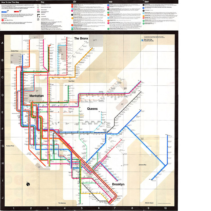
A recent family trip to NYC rekindled our interest in the work of design genius Masimo Vignelli. In this case, our attention was drawn by a small display at the Museum of Modern Art featuring Vignelli's work on the 1972 version of the New York MTA City Subway map – one that fell under the scrutiny of many New Yorkers, unhappy with it's geometric styling and inaccurate proportions. It was replaced after just seven years in action with a new design by Mike Hertz and whilst being geographically accurate, as far as getting from A to B is concerned, it has arguably made the experience somewhat complex for visitors. But what do we know? 30 years down the line and Hertz's core map, bar a few upgrades, endures.
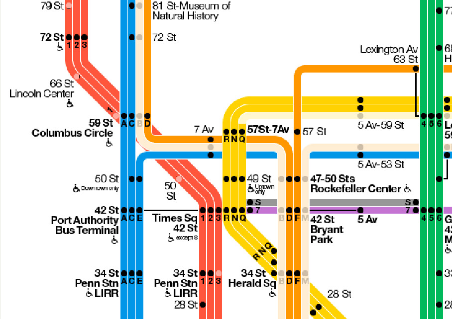
For lovers of the more functional and modernist subway guide, all is not lost: they can enjoy the digital version of Vignelli's map, renamed The Weekender, or in its own dedicated phone app.
The Weekender map
The Weekender app
Massimo Vignelli 1931–2014
Mike Hertz interview: the Gothamist
Even better! Buy one here